Overview
The Critique is an online blog for those with an interest and passion for philosophy and the many discussions that entail with it. It acts as a source for information with daily articles on current events and aims to provide an appreciation of the relevance that philosophy has on daily lives.
I was approached to design the initial brand for the company as well as develop the company website.
Process
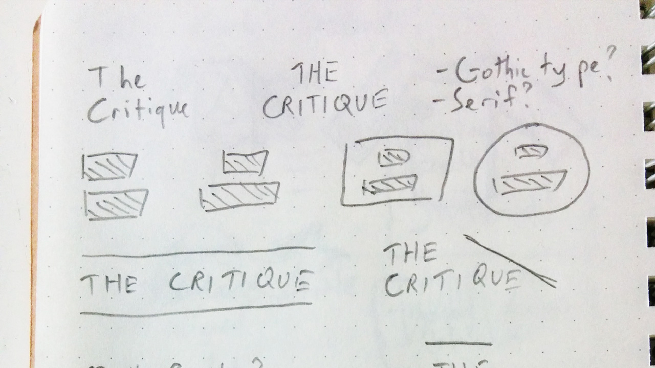
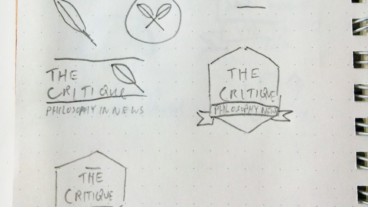
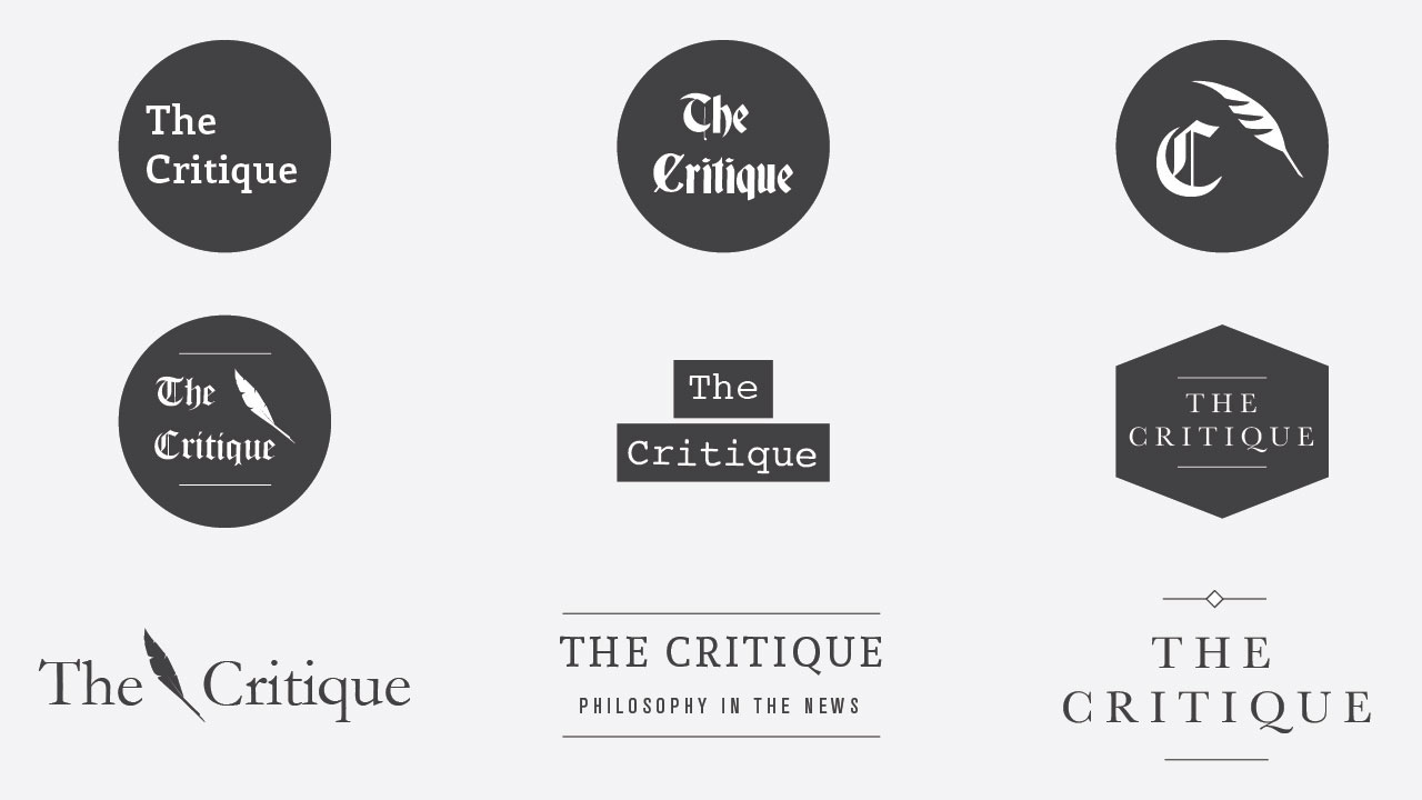
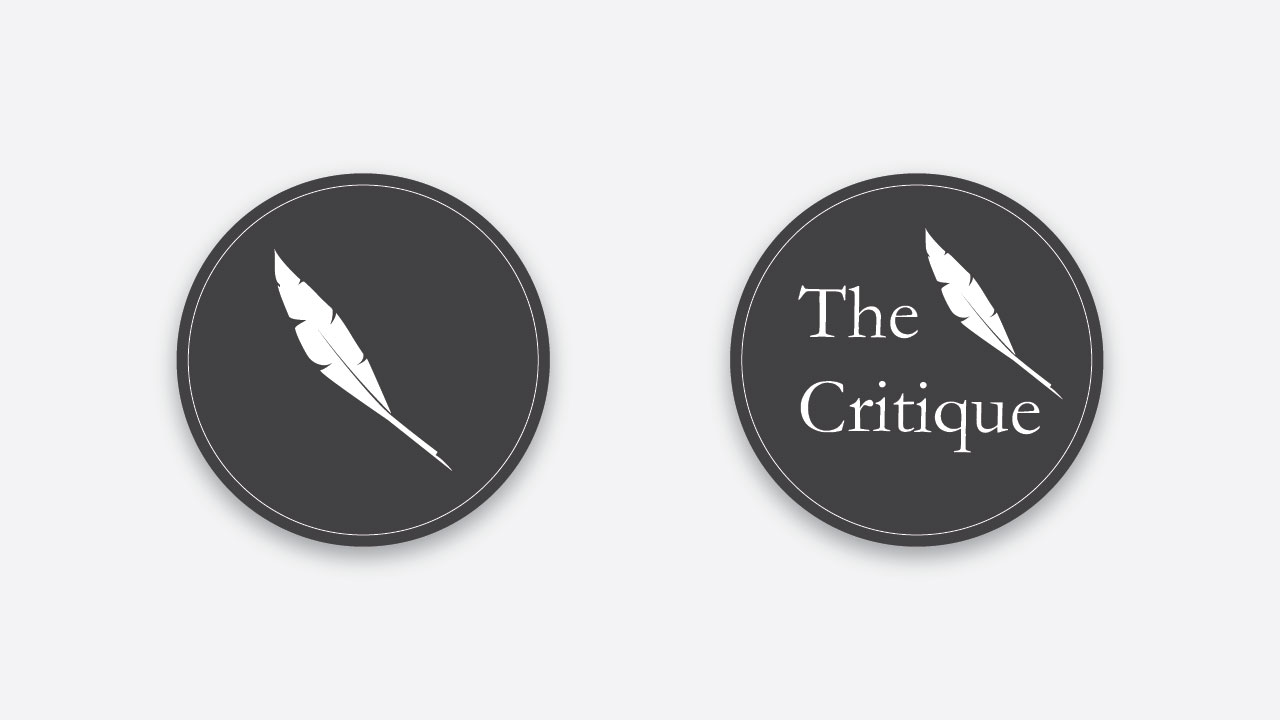
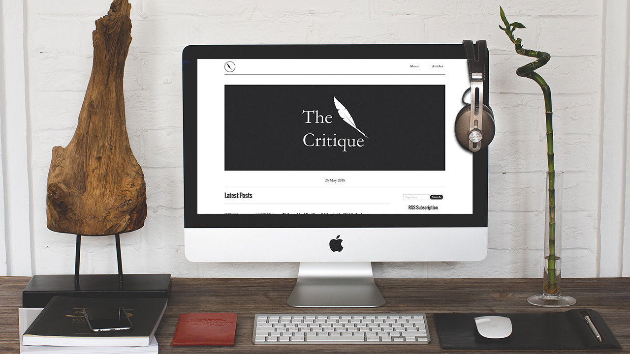
After being briefed by the client, my first task was to design a logo for the company. The key theme that needed to come across was philosophy in the news and the client quite liked the idea of a quill being incorporated. After producing several variations with different typefaces and forms, the client settled on a simple combination of a quill and a serif font with two variations.
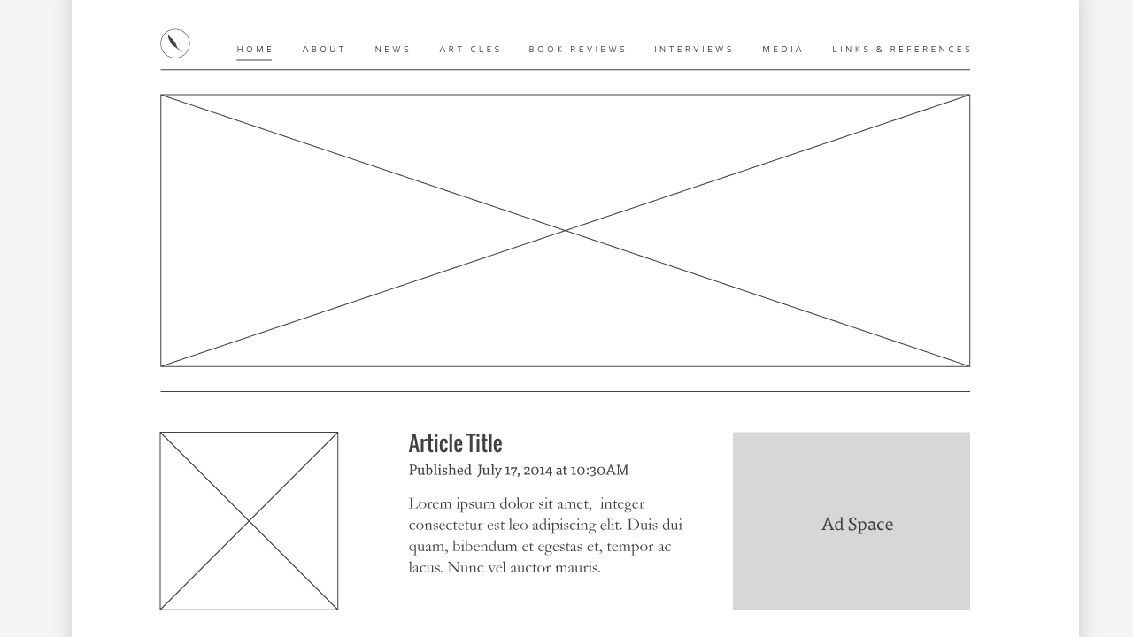
With the new logo in hand, next came the fun part: developing the website. Not being the most familiar person with Wordpress, it was a pretty daunting task initially. But with past knowledge of HTML and CSS, it wasn't too steep of a learning curve.
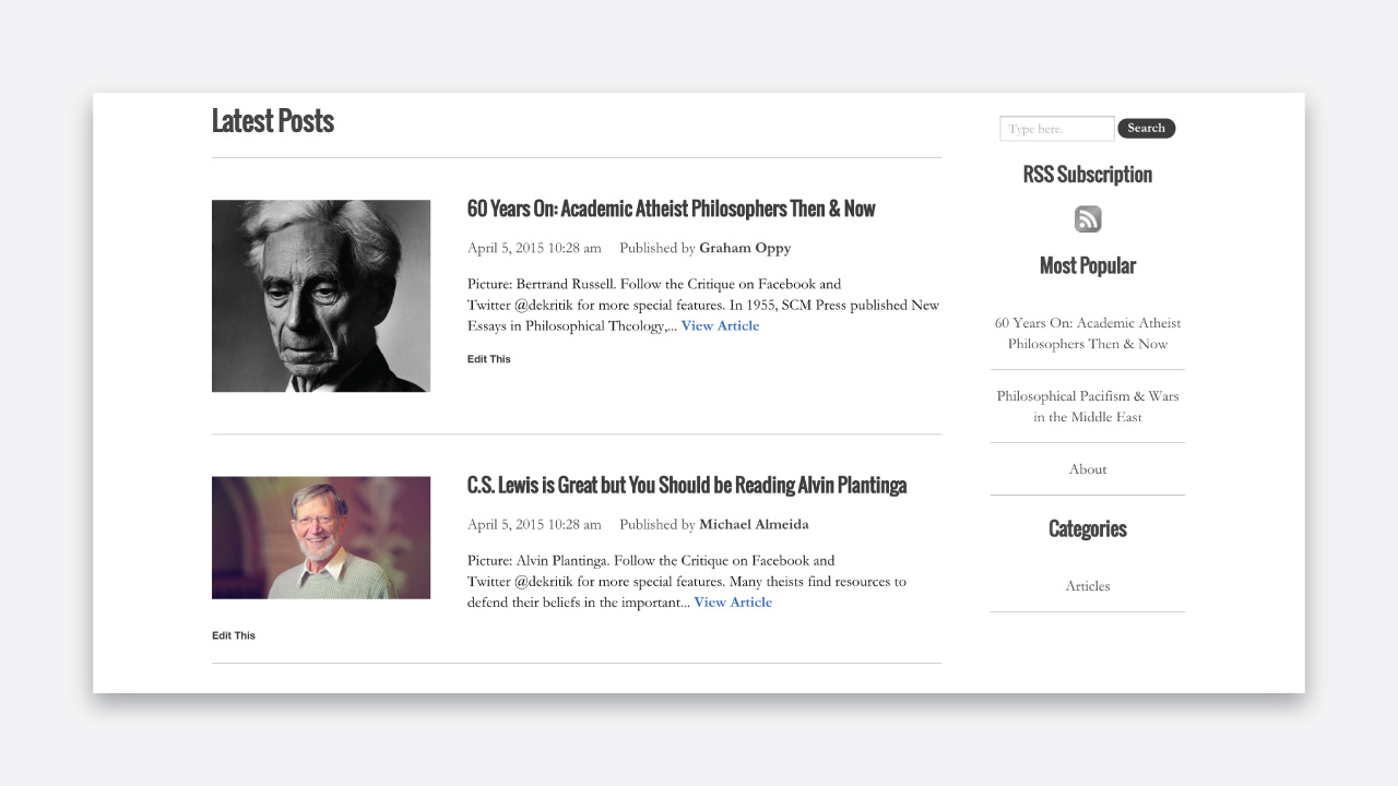
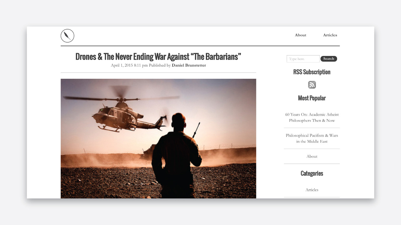
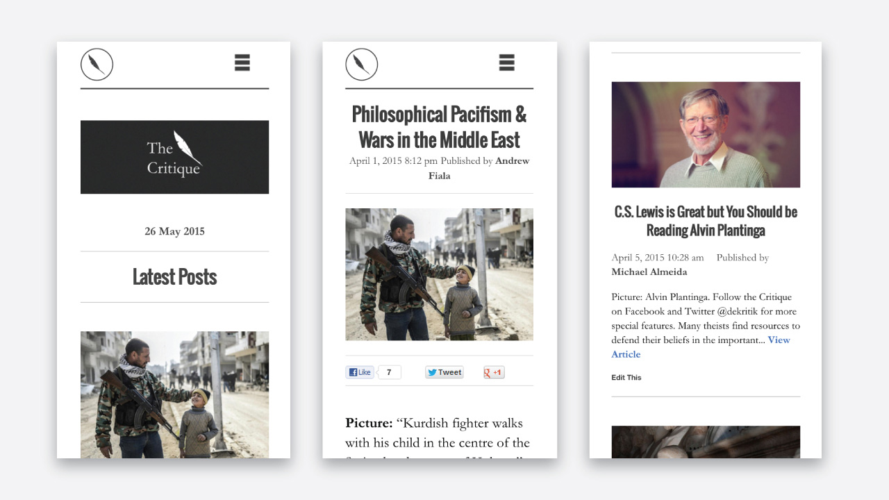
The aesthetic was intended to resemble a newspaper with a very black and white color palette and serif typeface. As the site was less focused on images and more on philosophical ideas, the bodies of text needed to be large and impactful.
The key usability idea needed for the website was to be able to easily browse through articles and have a focused reading experience. Ensuring the site was mobile friendly was also a priority, with the elements reconfiguring to a minimalist, easy-to-read layout.
The website is still undergoing various upgrades here and there, but it has managed to cater to the needs of a 2000+ strong, online community who bear a passion for philosophy. If philosophy's your thing, why not check it out!