Overview
Teekay Corporation is a world leader in the marine energy industry and continues to grow with it’s subsidiary companies.
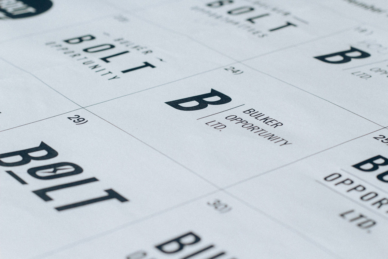
During my time working with the company’s Corporate Communications team, I was tasked to design a logo for a new subsidiary company called BOLT (Bulker Opportunities Ltd.) that Teekay was to co-own with another company, CarVal Investors.
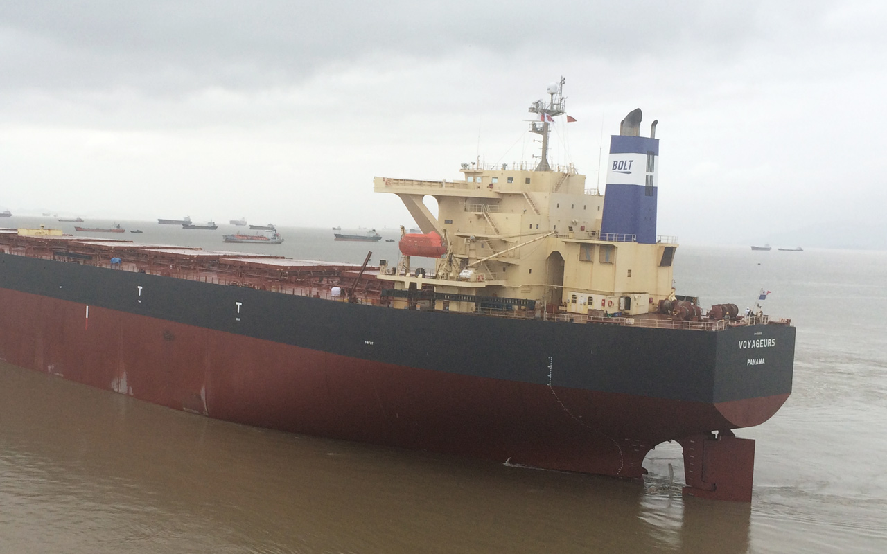
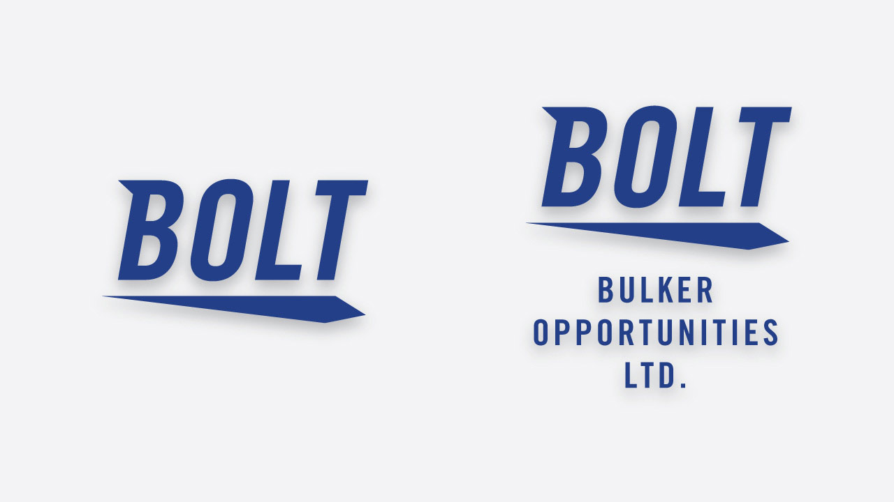
This logo was to be placed on various branding materials and to be printed onto the funnels of the vessels that the company owns. Two different versions of the logo were required for different use cases: one to be printed on branding materials that didn’t require the company’s full name and one that did.
Process
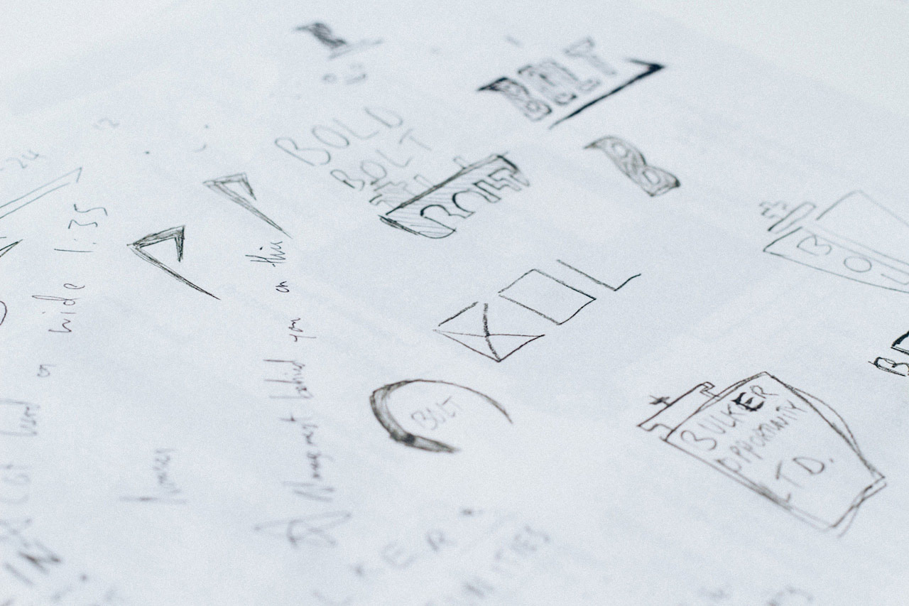
The initial ideation process began with gathering information on what values unified both companies. Utilizing the brand guidelines of both Teekay and CarVal, I produced several initial ideas to get an idea of the sort of logoform the stakeholders were interested in. The request was to create a logo with a modern feel and conveyed a sense of energy.
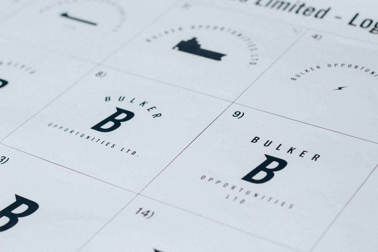
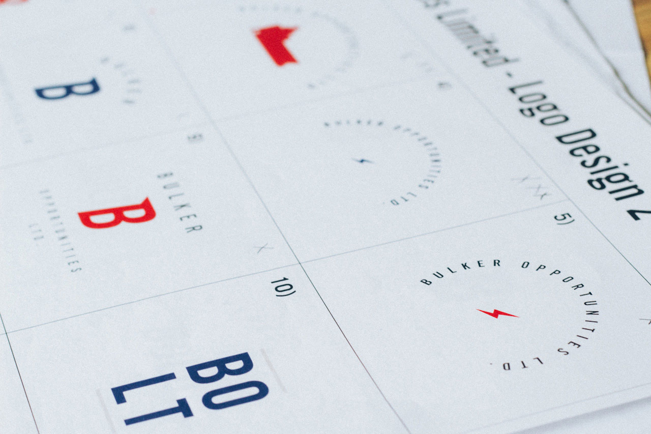
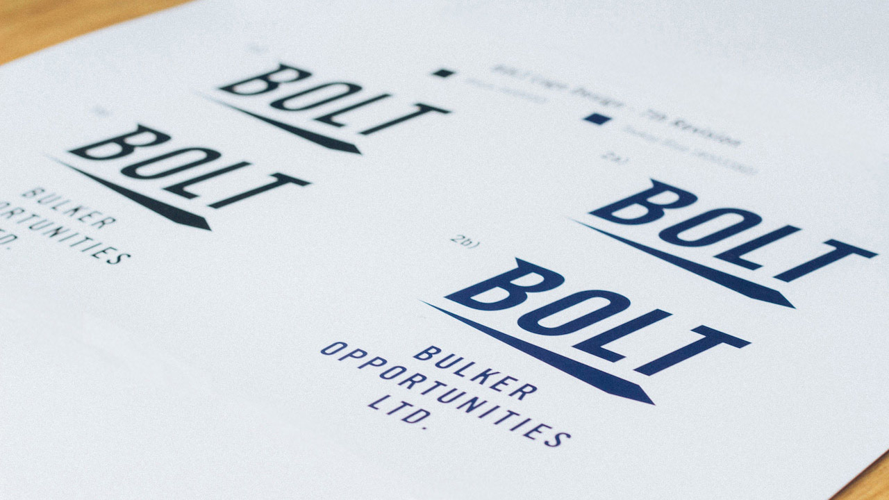
From these sketches, the stakeholders were drawn to the dynamism and movement that some of my ideas captured. With this in mind, I incorporated the feeling sense of motion into the logo and it’s typography. After further development, the stakeholders were drawn to the shape underneath the typography and settled on that as the logo. I also created the logo that required the company’s full name was with centre aligned typography underneath the logo form, so as to not disrupt the motion.
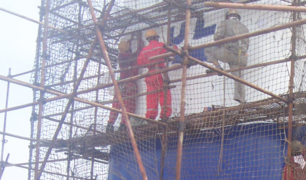
And here's the logo being printed onto the vessel funnel. It was a really cool experience seeing my work go from paper to a vessel funnel!